Before requesting any support Please search the Forum First. You may find your desired answer. This will save your waiting time and will save our working hour. We may not answer the question which we have already answered. You should also read our Support Policy
Is is Possible to use a Seperate Mobile Menu Location or Mobile Only Menu Item ?
Is is Possible to use a Separate Mobile Menu Location or Mobile Only Menu Item ?
The answer is YES and NO. Currently, none of our Themes has any Specific Mobile Menu Location. All of our Themes are Mobile Friendly or Responsive. So, the Main Menu can show the items in all type of devces arranging as per the styles.
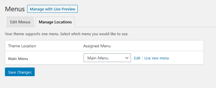
One Menu Location:
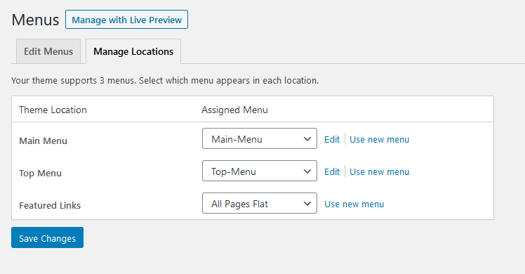
Multiple Menu Locations:
You may have any Plugin which can allow you a Separate Mobile Menu Location for Separate Mobile Site. But, as the Themes are Responsive, you need not Separate Site for the Mobile Devices.
But, you can still show Some Menu Items for Desktop and Some for Mobile Devices only.
First of all, Please make sure that the Responsive Layout is Active from WP-Admin > Appearance > Theme Name Options > General Options
Step 01
Use the Custom Code in the WP-Admin > Appearance > Theme Name Options > General Options > Custom Code within Head Area Box
1
2
3
4
<style>
@media screen and (max-width: 900px) {.showindesktop{display:none;}}
@media screen and (min-width: 901px) {.showinmobile{display:none;}}
</style>
You can change the 900px and 901px as per your demand.
Step 02
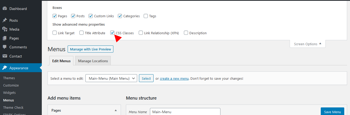
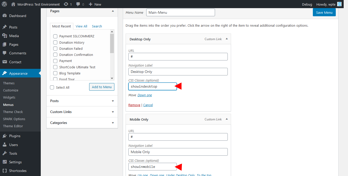
Check the CSS Classes from WP-Admin > Appearance > Menus > Edit Menus
Create Menu Items and paste the CSS Classes (optional) Boxes as showindesktop or showinmobile where necessary. It is not necessary for all other Menu Items which will be displayed for all devices.
Clik the Save Menu Button.
Now, Check the Site in a Desktop or in a Mobile Device. showindesktop marked Menus will be displayed in a Desktop and showinmobile marked Menus will be displayed ina Mobile.
Author
Posts
Viewing 1 post (of 1 total)
You must be logged in to reply to this topic.
We use cookies on our website to give you the most relevant experience by remembering your preferences and repeat visits. By clicking “Accept”, you consent to the use of ALL the cookies.
This website uses cookies to improve your experience while you navigate through the website. Out of these, the cookies that are categorized as necessary are stored on your browser as they are essential for the working of basic functionalities of the website. We also use third-party cookies that help us analyze and understand how you use this website. These cookies will be stored in your browser only with your consent. You also have the option to opt-out of these cookies. But opting out of some of these cookies may affect your browsing experience.
Necessary cookies are absolutely essential for the website to function properly. This category only includes cookies that ensures basic functionalities and security features of the website. These cookies do not store any personal information.
Any cookies that may not be particularly necessary for the website to function and is used specifically to collect user personal data via analytics, ads, other embedded contents are termed as non-necessary cookies. It is mandatory to procure user consent prior to running these cookies on your website.
 .
.