

Do you know that you have only a couple of seconds to convince the audience that your website is the correct place where their search ends! This means you have to display something unique and pleasing in those crucial seconds that engages your audience. This article will show you how to Boost the Conversion Rate.
The internet is full of numerous options and you don’t even know how many competitors are actually offering the same services. Your audience is always expecting a great user experience along with the availability of relevant stuff.
If you are striving with low conversion and a higher bounce rate, your website design could be a possible reason! The design of your website speaks a lot about your services and overall reliability, which is the reason you should emphasize the same.
Check out some of the fruitful designing tips to bump-up the conversion rate.
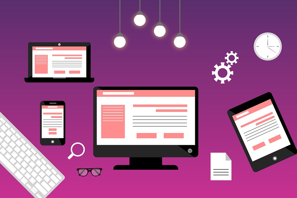
The users that you wish to convert into clients are always on a hunt for a website that is well optimized for smartphones. You have to accept that users no longer prefer visiting a website from their PC’s or laptops just because of the fact that the same could be accomplished by a single tap on their smartphone.

For those who don’t know what responsive design is; it is the ability of the website to adjust the layout as per the screen size and highlighting the menus for the users. The automatic adjustment of the screen lets the users quickly find the menu bar and the desired content without the need to scroll.
You would never want your audience to get annoyed with those bulky pages that require frequent scrolls to access the desired content. Thus; it is always recommended to ask your website designer to develop a responsive website that can help engaging users in a fraction of seconds.
As per the latest survey, 70 percent of the total traffic on the internet access the same through their phones or tablets rather computers. This could be the biggest reason for you to rely on a mobile-friendly design that is compatible with almost every smartphone or tablet.
One of the crucial elements of great website design is the call to action button. Your users can quickly contact you through this button if it is placed at the appropriate position. The button should be visible to the audience and should be appealing enough to ensure that the user clicks as soon as it is visible.

It is always rewarding to design the button with the most tempting colors so that your audience simply can’t resist sharing their contact details with you. Here are some important aspects that should be kept in mind while designing a call to action button:
These aspects must be kept in mind while you are designing the call to action button for your website.
Another design flaw that can impact your conversion rate is the placement of relevant content. Your audience’s decision could be altered with the right content placement. This simply means you have to be sure enough that the content on your website is up to the mark and is displayed in the most appropriate manner.

The pattern in which your content is presented to the audience is the most crucial thing that can impact your conversion rates. This is the main reason why most ofthe businesses are having great traffic on their website as they know how to place content in the right position.
It would be nice to start placing your content from the top left and while moving downwards, you need to ensure that the content ends in the left position of the website instead of the extreme left. This is the most acceptable and user-friendly pattern of content on a website.
You can check the most appropriate websites online that can give you an idea about the placement of the content.
The user should be aware of their current location on your website and must have a clear idea about the pages where they need to go. A lot of people ignore the importance of putting the right navigation to their website, which is the main reason why they are not able to convert leads into clients.
The navigation of the website should be designed with high priority and by emphasizing the most crucial objectives so that the user easily navigates through the website. This surely helps in augmenting your business revenues as the users would be clicking on the products that are categorized in a dedicated portion of your website.

Proper designing of menus, bars, and other elements should be done without ignoring the importance of right navigation. As per the designing experts out there, your website’s easy navigation has the potential to convert users into clients if designed professionally. Just ask your website designer to pay close attention to the website’s navigation whenever you are about to design a website for business purposes.
You cannot expect organic leads if your website isn’t loading fast. There are thousands of websites out there that are offering similar services just like your company, and you have to be competitive enough to beat them.

When we talk about the researches, a second’s delay could affect your conversions up to 8 percent, which is quite huge when you are planning to generate good revenues from your website. Thus; it becomes crucial for you to pick the right optimization strategies to bump-your website’s loading speed.
Here are some fruitful ways to boost the loading speed of your business website:
These simple steps could help you in improving the overall loading speed of your website without many efforts.
As per the abovediscussion, one simply cannot deny the fact that the conversion rate depends on your website design and user experience. Thus; a little negligence to these aspects could adversely affect your conversion rates and eventually your business revenues.
Comments are Closed