

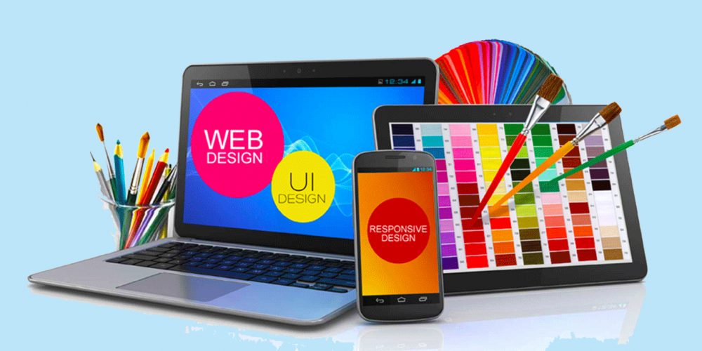
It's well-known, that visual design is a key to your website's success. It provides your visitors with a big amount of necessary information and makes a first impression, which can influence your benefit strongly. For this very reason it is so important to create an effective page layout for your website. But don't hurry to hire professional designers and web-developers! Fortunately, each Internet user has an opportunity to create a perfect website on one's, without any programming skills.
In this article we consider the main rules for novice web-designers and website owners, which will help you to attract new clients and hit any tastes. So, if you want to build a powerful web-project, just look through the basic web-design principles and try them.
Choosing an appropriate background is a very important process, as it will influence the whole webpage design. You should understand that your customers will look for something useful and valuable at your website. They won't look through your pages just to enjoy the background design, so it shouldn't steal their attention. Therefore, it's better to make your background clean and emphasize the main content. Without any doubts, simplicity is the best feature of a successful webpage. And the only thing you should do is to use it properly.

As you can see, there are lots of extremely bright and excessive elements on the Internet. Many website owners fill their webpages with different animation effects and flashy pictures. But when you use such things in a proper way, they are very effective, as they attract viewers. Bright details should catch their attention and make them focus on the main points: your services, prices and special offers. Besides, you could use bold type font and italics. In addition, you should be careful with colorful text. First of all, it should be readable and easy-to-understand, so it's recommended to avoid multicolored texts, because they are difficult to read.
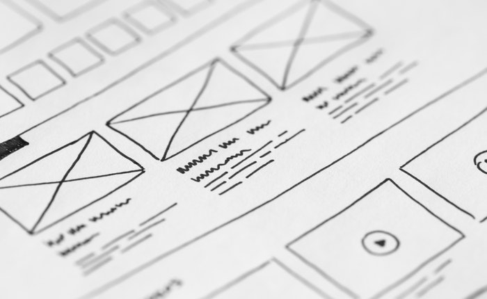
Use the rule "less words=more sense" and don't overload your website with long and boring texts. Otherwise, you will irritate your clients like an awful marketer, repeating the same again and again. Read all your texts once again and try to shorten long paragraphs and sentences to make your content conversational and clear. Let your readers 'breathe' between the pieces of content and they will enjoy using your website. This way they will have an opportunity to find everything they need in a quick and simple way and learn something new.

It's an open secret, that classic is ageless. So, we highly recommend you to pay attention to classical elements. They are familiar for your users, and therefore they will understand the structure better. Think over, how you can use classy details to make the navigation easier and create a powerful web-design. For example, you can use a traditional black-and-white color scheme and it will look stylish, elegant and eye-catching.

Don't be afraid of leaving empty places on your website. You have no need to stuff your pages fully, because such designs look chaotic and are difficult to understand. It is better to use additional pages and a dropdown menu to place more offers. This way your website will be user-friendly and clear, as the customers will be able to find exactly what they need swiftly.
Surely, your clients will visit your website to find the definite things or articles they need. Moreover, they will prefer well-built sources, which never overload viewers with unnecessary details. Try to create a website, where your clients will be able to find what they need in 2 or 3 clicks. Besides, you can add extra bright buttons or other elements, which will make your website eye-catching. Each person wants to use their time effectively, and a useful navigation will definitely satisfy your customers.

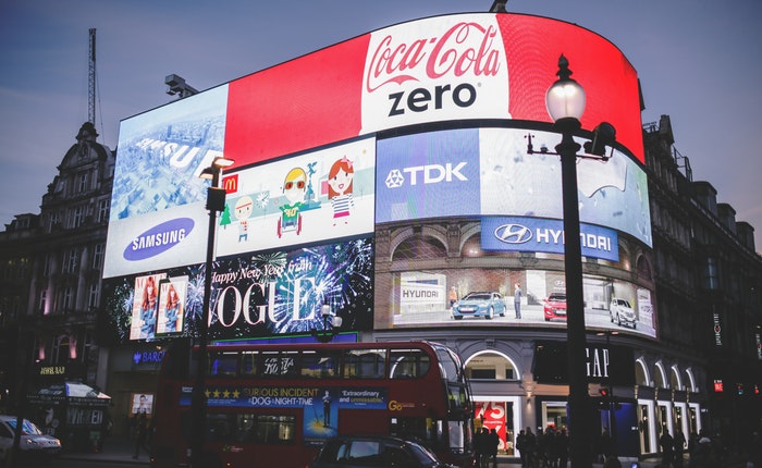
Without any doubts, you have already faced the websites, where full-screen ads appear automatically. Such advertising can not only scare your clients and make them dissatisfied, but also influence your SEO-ranking negatively. According to new rules of Google SEO-ranking, the websites with big advertising will sink in the scale of search results. As a result, such ads will lower your traffic. So, if you use this sort of methods, we recommend you to refuse this strategy. Its profit will be blocked by losses, and it will make a negative influence on your projects. It's better to place a beautiful picture, which will attract viewers and make your website visually appealing.
Color is a powerful tool in web-design, so you should work with it carefully. According to the color perception theory, people like color combinations that have maximum 3 basic tones included. It's very important to choose the best matching to create a harmonious and visually appealing web-design. You can use a color wheel and combine tones on your own, or you can find ready-made color schemes on the Internet. No matter which way you will choose, your color palette will be eye-catching and attractive. If you have doubts, choose soft and tender pastel shades, which fit any tastes.

Modern Internet users often use mobile devices instead of PC. It is very convenient, as they can look through various websites, order services, and even buy something online in any place they like. Undoubtedly, such users are the most part of Internet-audience, therefore you should create convenient and clear responsive pages for them. Besides, mobile friendly websites have a better SEO-ranking, so it will help you to build targeted traffic without any great effort.

Also, you should always test your webpages and check whether they are valuable or not. It will help you to solve all problems in advance. Additionally, you could ask your friends or family members for help. Besides, you can ask other Internet-users to test your website's usability, as they have a fresh perspective and can give a fair feedback. Furthermore, you can even add a simple built-in commenting system to your website to take into account users' wishes.

Now you know everything you need to create an awesome powerful web-design for any online projects. So why to wait? Try it right away! And remember: who dares - wins.
Comments are Closed