
Imagine a situation where a tree fells nearby in the forest. Have you wondered why did it fell? It's because you lacked in some aspect. Similarly, when a website fails, somewhere we as website owners are responsible for it. Well, while reading the following blog post brace yourself for some brutal honesty as I'm not going to sugar coat anything here. I'm laying it out for you. The chances are that you might hate reading the post or get angry or feel discouraged. Hating online pages bearing forms has become a little passé, time break the monotony and make the change! In this article your will learn to use Forms in WordPress in creative ways.
Despite being a crucial aspect on every website, everyone hates filling those monotonous forms (including us as owners), why? It's quite simple and straightforward, poor designing and irrelevant placement of elements on the page compels the user to switch to the competitors. So what needs to be done? No brainier! Make people fall in love with these pages with simple little boxes; after all, they aren't any creepy looking monsters. There are a lot of reasons to hate a website form; for example, the way they pop up right in the middle of getting something done. I mean you are reading a post or commenting on a blog, or you are starving and wish to order something online and all of a sudden a form pops up asking you to register first. It's quite annoying! How about this; in the eyes of the end-user, a form is more like a big fat bouncer standing right at the gate of your favorite nightclub, and you aren't allowed to get in unless you have registered properly.
Well, to be fair, forms receive so much hate for something they are not truly guilty of. On the contrary, it is the process associated with it makes it more annoying. For an e-commerce entrepreneur, forms can be considered as a silver bullet as they have the potential to make a significant impact on the buying experience. Creating a form that is not just optimized or carefully crafted but also an interesting tool used to catch relevant information regarding customers and act as a catalyst to speed up the conversion process.
Another major concern is, WordPress webpreneurs often put a very little to no emphasis on enhancing forms. For them, a form is just a mere form, and they think there isn't pretty much they need to do about it. To be honest, it is a completely wrong approach. From time to time, form testing should be done by this; only this is the way through which your forms can be improved slowly. For example, A/B testing of forms can be an excellent idea as here you get the opportunity to compare even the slightest different in regards to designs and concepts. Which also means you have a fair chance to optimize step by step. Further below, I would like you to get acquainted with certain best practices that must be taken into account to enhance UI and UX of your WordPress site.
There is no denying in the fact that form is the most important competent of the sales funnel. So as a responsible person, you need to make sure that your forms are easy impressive and sleek. Unfortunately, many websites fail to optimize their forms for usability, here we are going to highlight some of the best form design practices with some overlooked opportunities to maximize your form fields. Let's move to whole another level.
There are many Plugins in WordPress Repository which can generate Forms in WordPress easily. You can use our Free and Premium Themes to show Forms in WordPress by any of those Plugins of your choice.
Forms are often being misunderstood, and that's the reason why they are annoying. What you can do is, reveal the sole purpose of the form right then and there. And make sure you add how filling it would benefit your end user. Moreover, it is very obvious that your end users are highly concerned about the information they offer to your site. So what you require doing is ensure that their info is in safe hands and how you will use it.

Deploying Google Captcha or google reCAPTCHA is a good practice; it prevents web forms from spam abuse. As a result, the fear of being spammed automatically gets removed, and the user becomes more comfortable to fill it out. However, you will come across a lot of forms available for WordPress and WooCommerce that are powered by Google reCaptcha. Take a look!
The ideal way to simplify your forms and remove frictions is to think like a user. Analyze these spots that can cause hindrance and communication barrier. According to all the countless studies, it is revealed that the more information you ask from the user, the less likely they are to give it to your business. By compelling them to switch to your competitors, you won't risk yourself of losing a ton of conversion.
So in such a situation, ask the information which is genuinely required. And this is something that has to be done right away. Strip down your forms to a minimal. Also, ensure that the length of your form is directly proportional to the drop off rate. The longer your forms are, the higher the drop-off rate. According to Neil Patel, he was able to increase conversions by 26% by removing just 1 field from his contact form. One of the best ways I have encountered by far to allow people to log in via google, FB, or Twitter. By doing this, you won't just cut down on steps, but also customers will no longer have to put their emails, and username and friction as they will be automatically removed. So what you need to do is the idea of minimalism is something you should continuously put it into practice especially when designing the user interface of forms; yes I am talking about "less is more."
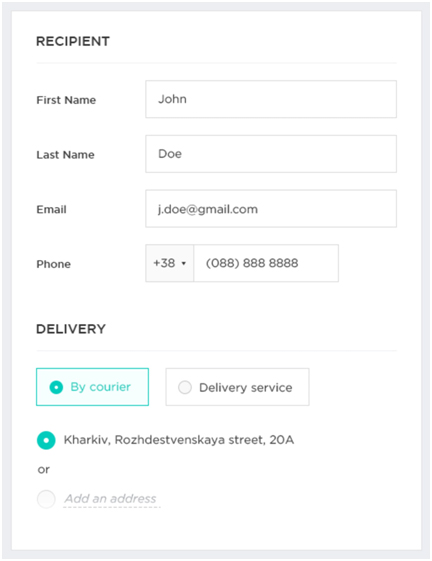
Can you believe this that using a single layout delivers result beyond expectation. Multiple column layouts create ample of confusion about which field needs to be completed first. So, imagine a situation where there is only one input field per row; I am sure you won't have any confusion at all. I mean the speed of the process will automatically increase, reducing the frustration of the end user. In addition to this, having a single layout also reduces eye movement as users only need to look one way instead of looking all around.
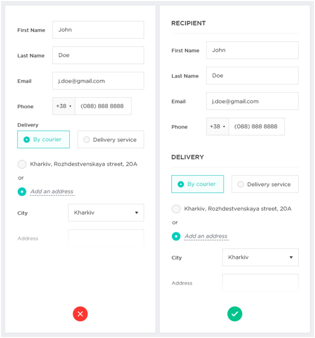
Another innovative way I would personally recommend to keep end users intact and make forms less aggravating is to split your forms into multiple steps. Multi-step web forms out-perform generic single-step forms as the first impression is less intimidating. There are only 2, 3 fields in the first step. The customer gets trapped, which gives you the opportunity to ask for sensitive information in later steps as the customer has already come a long way so he/she won't want to lose the progress. In fact, choosing multi-steps forms are comparatively easy to digest. However, this point can be a bit troublesome, especially if the internet connection is low. I mean the steps might take a bit longer to load. Hence, keep the pages clean and optimized for slower connections.
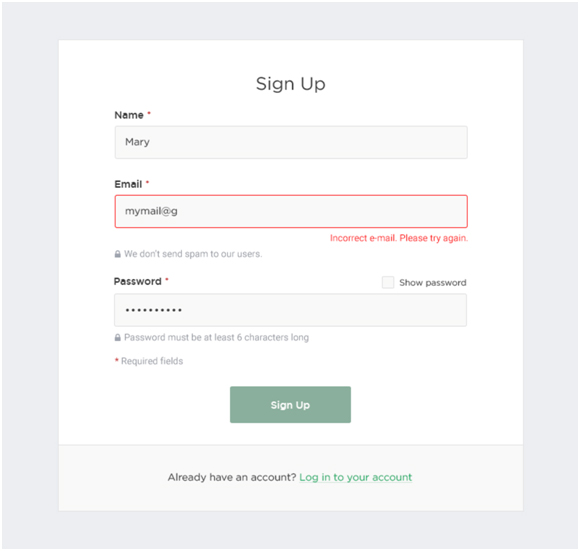
Here, users are ensured to put some valid information as he or she moves around the form. For example, if someone enters incorrect contact details, a red text automatically appears stating something is wrong then and there. With inline validation, WordPress website owners can:
Filling out forms today has never been so simpler, faster, and easier than ever- all thanks to Google Chrome and Firefox. And you know what the best part is? These browsers can fill the information for you by themselves. As per Google’s research auto-filling helps users fill out forms 30% faster.
To make this work, you must consider easily creating distinguishable context clues, like "Country" or "First Name." In addition to this, you can even think of using auto-fill city and region based on geolocation. Also, they can get it from their account if the user is already registered. However, always leave the fields available for editing to give control over the process.
Last but certainly not the least, call to action is one of the most overlooked aspects across the globe. But what you may not know is a clear and definitive call to actions can not just bridge the communication gap but also persuade the user to accomplish the process. Failing to optimize is CTA'S is one of the crucial reasons for why marketers end up lowering to turn traffic into conversions. So what you can do is:
If you wish to increase your online business revenue, you need to know that forms are one of the most essential parts of this. Keep yourself updated on a daily basis, I mean something that is modern today, may become old and overused in the following years.
Lastly, incorporating any of the aforementioned pointers will surely return you the favor.
We believe that this article has covered most of the points on using Forms in WordPress creatively. You can find more articles on WordPress, SEO, Website, Design, Development, Customization, Speed, Optimization Tips in our Blog Section. Our Themes are ready to use different WordPress Forms Plugins. Those Themes have Free Versions, too. Please let us know your ideas about the improvements of this article for Forms in WordPress.
Comments are Closed